Tuesday, March 25, 2014

Capt’n Sapo (finished)

Figone : 68mm Bust
Sculpted by Allan Carrasco

I've already finished my Sapo, my first painted bust ever :) It was a real pleasure painting this beautiful bust and I really enjoyed during the painting process. I've learned many techniques that I tried an experiment and applied on this bust. I'll definitely buy another bust to paint it again. May be another bust from Figone, we'll see :)

ผลงานการเพนท์บัสชิ้นแรกของผมครับ ผมมีความสุขและสนุกมากในการทำงานชิ้นนี้  อาจจะเป็นเพราะได้ทดลองเทคนิคการทำสีใหม่ๆหลายอย่างๆที่ไม่เคยลองมาก่อน แล้วนำมาประยุกต์ใช้ในงานชิ้นนี้ ซึ่งเป็นประสบการณ์ที่ดีและรู้สึกพอใจกับผลที่ได้มากครับ แน่นอนว่าในอนาคตคงจะหางานประเภทบัสมาทำอีกครับ ไม่แน่อาจจะเป็นบัสท์ตัวอื่นๆของทาง Figone อีกก็เป็นได้ครับ


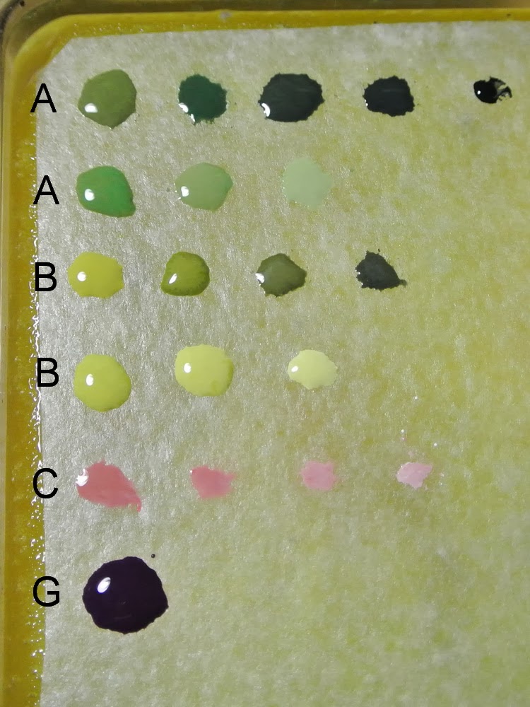
Also, this was my first time to use the metallic paints "Silver Paint Set" from Andrea. I bought it several months ago after disappointed in metallic grain from the other brands. After tried it on the metallic part of Sapo, I think the result is better than the previous metallic paints that I used especially on the metallic grain. It also easy to blend and gradient the colors with ink that comes with this paint set. Maybe I'll write an article about how to paint true metallic metal with this paint set in the future.
By the way, there is another metallic paint set from Scale75 that looks very interesting after I saw an experiment of using it on Volomir's blog. I don't know which brands has a better result, maybe the best way is to try it by yourself.  Happy painting to all of you :)

นอกจากนี้ นี่ยังเป็นครั้งแรกที่ผมได้ลองใช้สีเมทัลลิค "Silver Paint Set" ของ Andrea ครับ ผมซื้อมาเมื่อหลายเดือนก่อน เพราะเคยลองใช้สีเมทัลลิคของยี่ห้ออื่นๆแล้วไม่พอใจกับเกร็ดของสีที่มันดูใหญ่เกินไป หลังจากที่ได้ลองใช้สีชุดนี้แล้ว รู้สึกว่าผลลัพท์ที่ได้จะดีกว่าสีเดิมที่เคยใช้ โดยเฉพาะเกร็ดของสีที่ดูละเอียดกว่า และการใช้งานยังง่ายต่อการเกลี่ยสีและไล่น้ำหนักแสงเงาด้วยสีหมึกที่มีมาให้พร้อมกันในสีชุดนี้ บางที่ถ้ามีโอกาสผมอาจจะทำบทความเกี่ยวกับการใช้สีชุดนี้มาให้ได้ลองดูกันครับ ว่าใช้แล้วออกมาเป็นอย่างไร
อีกอย่างนึง ตอนที่เขียนอยู่นี้มีสีชุดเมทาลิคที่ออกมาซักพักแล้ว ของ Scale75 ครับ ผมเห็นตัวอย่างการทดลองใช้งานของสีชุดนี้ในบล็อกของ Volomir ดูแล้วน่าสนใจมากครับ ผมไม่แน่ใจว่าระหว่างสองยี่ห้อนี้ ยี่ห้อไหนจะให้ผลลัพท์ในการทำงานที่ดีกว่ากัน ทางที่ดีคงจะต้องลองใช้ด้วยตัวเองดูครับ Happy painting ครับทุกท่าน :)

Sunday, March 23, 2014

Capt’n Sapo (wip8) Step by Step - Painting leather straps

This is my second tutorial about painting leather, the first tutorial was about how to paint the texture of cracked leather on the whole surface (you can see it HERE) This time I focus on wear and tear on leather surface that often seen in the area was frequently used, such as the leather strap or belt.

เป็นครั้งที่สองที่ผมเขียนบทความเกี่ยวกับวิธีการทำสีของหนังสัตว์ ซึ่งในครั้งแรกนั้นจะเป็นวิธีการทำสีของหนังสัตว์แบบที่เป็นรอยแตกอยู่เต็มพื้นที่ (ลองเข้าไปดูได้ที่นี่ครับ Click Here) ส่วนในครั้งนี้จะเป็นการทำสีของหนังสัตว์แบบที่มีการสึกหรอที่เกิดมาจากการใช้งาน เช่นรอยขูดขีดหรือฉีกขาดต่างๆ ซึ่งจะพบเห็นได้บ่อยๆในสิ่งของที่ทำมาจากหนังและถูกใช้งานอยู่ตลอด เช่นสายรัดหรือเข็มขัดหนัง


I started by priming the leather area with German Cam. Black Brown.

ผมเริ่มจากทารองพื้นในส่วนที่เป็นหนังด้วย German Cam. Black Brown


Then I apply the first highlight with Leather Brown on the edges of the strap and raised area

จากนั้นทาสีไฮไลท์ชั้นที่หนึ่งด้วย Leather Brown ในบริเวณขอบของสายรัดและส่วนที่เป็นสันนูน


I used Beige Brown as a second highlight and apply it on the edges and raised area again. Then add some of very fine scratches randomly on the the same area, in order to simulate the appearance of wear and tear.

ผมใช้สี Beige Brown เป็นสีไฮไลท์ชั้นที่สอง และทาในบริเวณขอบและสันนูนอีกรอบหนึ่ง จากนั้นเพิ่มรอยขีดข่วนเป็นเส้นเล็กๆ ทาแบบสุ่มๆ ลงไปอีกที เพื่อจำลองลักษณะของการสึกหรอที่เกิดจากการใช้งาน


I used German Cam. Black Brown mixed with Black for the shadow area and apply it to the recesses area with glazing technique. I also add more scratches with this color randomly as well.

ผมใช้สี German Cam. Black Brown ผสมกับสีดำ สำหรับเป็นสีในส่วนของเงา และทาลงในบริเวณร่องหรือส่วนที่อยู่ต่ำกว่า โดยใช้เทคนิคแบบ glazing เพื่อเคลือบให้สีของเงานั้นค่อยๆเข้มขึ้น นอกจากนี้ยังใช้สีนี้ในการทำรอยขีดข่วนเล็กๆเพิ่มเติมด้วย

For third highlight, I used Beige Brown mixed with Orange Brown and Ivory, apply to the same area of previous highlight. Also, add more random scratches with this color especially on the edges of the shadow scratches from previous step.

สำหรับสีไฮไลท์ชั้นที่สาม ผมใช้ Beige Brown ผสมกับ Orange Brown และ Ivory และนำไปทาในบริเวณเดียวกับไฮไลท์ก่อนหน้านี้   นอกจากนี้ยังเพิ่มรอยขูดขีดด้วยสีนี้อีกครั้ง โดยเฉพาะตรงขอบของรอยขูดขีดที่ใช้สีเงาเข้มทำเอาไว้เมื่อขั้นตอนที่แล้ว เพื่อให้เกิดมิติของแสงเงา


Then mixing more Ivory in the third highlight color and apply it only on the edges of leather to simulate the final highlight. Final step I glaze the recesses area again with shadow color and the raised area with Beige Brown mixed with Orange Brown, in order to reduce the color of scratches on shadow area and gives the orange brown tint on the highlight.

จากนั้นผมผสมสี Ivory เพิ่มเข้าไปในสีไฮไลท์ชั้นที่สาม เพื่อให้สีนั้นอ่อนขึ้น แล้วนำไปทาเฉพาะในบริเวณขอบของหนังเป็นส่วนไฮไลท์ที่สว่างสุด ขั้นสุดท้าย ผมทาเคลือบแบบ glazing ในบริเวณส่วนของเงาด้วยสีสำหรับเงาที่ผสมเอาไว้ และในบริเวณส่วนที่นูนด้วยสี Beige Brown ผสมกับ Orange Brown การเคลือบนี้จะช่วยทำให้สีของรอยขูดขีดในบริเวณเงานั้นดูเข้มและกลมกลืนมากขึ้น และยังช่วยเคลือบให้สีในบริเวณไฮไลท์นั้นดูเป็นหนังโทนสีน้ำตาลส้มครับ


Also, I used this method for painting the leather armor and straps as shown on the pics below, but I made it different by adding some cracks in the surface, in order to simulate the different textures of wear and tear on the leather.

นอกจากนี้ ในส่วนของการทำสีเกราะหนังและสายรัดที่เห็นในภาพ ผมใช้ทั้งสองวิธีของการทำสีหนังสัตว์ที่ได้อธิบายเอาไว้ มาใช้ในบริเวณนี้ ทั้งการทำรอยแตกและรอยขูดขีดต่างๆ เพื่อจำลองลักษณะการใช้งานของหนังสัตว์ที่มีพื้นผิวแตกต่างกัน


And here are the colors that I used for this method.
และนี่คือรายชื่อสีที่ใช้ครับ

1. German Cam. Black Brown (70822 )
2. German Cam. Black Brown + Black
3. Leather Brown (70871)
4. Beige Brown (70875)
5. Beige Brown + Orange Brown
6. (5) + Ivory
7. (6) + Ivory
A. Abaddon Black
B. Orange Brown (70981) 
C. Ivory  (70918 )


Monday, March 17, 2014

Capt’n Sapo (wip7) Step by Step - Painting toad eyes

For painting the eyes, I found a reference pic for the eyes that I like from the internet. I'm not sure is it frog or toad but I like the effect of the light reflected on the eye and I want to try on my Sapo. 

สำหรับการเขียนดวงตา ผมได้ภาพอ้างอิงของดวงตาแบบที่ผมชอบจากในอินเตอร์เนทครับ ไม่แน่ใจว่าเป็นตาของกบหรือคางคก แต่ผมชอบตรงที่มันมีรัศมีของแสงที่สะท้อนอยู่บนดวงตา เลยอยากจะลองนำมาทำในงานชิ้นนี้ดูครับ


After painted black basecoat on the eye, I draw an outline in a rugby shape on the center of the eye to create a pupil with Gold Brown mixed with Ivory, and use black to clean the excess of the outline until I get a correct shape with thin outline. Then I draw the reflected light on the pupil in asterisk shape (*) with ivory and put a small white dot for highlight.

หลังจากที่รองพื้นในดวงตาด้วยสีดำแล้ว ผมวาดเส้นกรอบของนัยน์ตาดำบริเวณกึ่งกลางของดวงตา ในรูปทรงแบบลูกรักบี้ ด้วยสี Gold Brown ผสมกับ Ivory แล้วใช้สีดำช่วยในการทาลบส่วนเกินของเส้นและตัดให้ขอบของเส้นนั้นคมและบาง จากนั้นวาดส่วนของแสงสะท้อนบนนัยน์ตาดำ ในรูปทรงดอกจัน (*) ด้วยสี Ivory แล้วจุดตรงกลางด้วยสีขาวเป็นไฮไลท์


Next step I paint Scarlett Red on the top and bottom of pupil. Then glazing with black till it has gradient from red on the middle till black on the sides. This color is not exist in the reference image but I want to put it on the iris, to make it has more colors on the eyes.

ขั้นต่อมาใช้สี Scarlett Red ทาในบริเวณด้านบนและด้านล่างของนัยน์ตาดำ แล้วใช้สีดำมาทาเคลือบแบบ glazing เพื่อให้สีนั้นไล่ระดับกันจากสีแดงตรงกลางไล่ไปยังสีดำตรงด้านข้างของดวงตา ซึ่งจริงๆแล้วสีแดงนี้นั้นไม่ได้มีอยู่ในภาพอ้างอิง แต่ผมเพิ่มเข้าไปเพื่อให้ดวงตานั้นดูมีสีสรรมากขึ้นครับ 


To create the textures on the iris, I put a small dots (Gold Brown) over the red area but not cover all of it, and put the dots clustered in the middle and spread out on the sides.

การใส่รายละเอียดบนม่านตา ผมใช้วิธีการจุดสีจุดเล็กๆ ด้วยสี Gold Brown ทับลงบนบริเวณสีแดงที่ลงไว้ แต่ไม่ต้องทับทั้งหมด ให้พอมองเห็นพื้นหลังสีแดงอยู่บ้าง และให้จุดสีนั้นกระจุกตัวกันอยู่ตรงกลาง และกระจายออกในบริเวณด้านข้าง


Then put a highlight on the dots with Gold Brown mixed with Ivory and final highlight with Sand Light specifically on the area over the reflected light on the pupil.

จากนั้นเพิ่มไฮไลท์ให้กับจุดสีด้วยสี Gold Brown ผสมกับ Ivory และเพิ่มไฮไลท์ส่วนที่สว่างสุด ด้วยสี Sand Light เฉพาะในบริเวณเหนือจุดแสงสะท้อนบนนัยน์ตาดำ


Last step I glaze around the edge of the eye with Scarlett Red Mixed with Royal Purple, in order to blend the colors on the iris over again.

ขั้นสุดท้ายทำการเคลือบสีบางๆ ด้วยเทคนิค glazing ในบริเวณรอบๆดวงตา ด้วยสี Scarlett Red ผสมกับ Royal Purple เพื่อให้สีของม่านตานั้นกลมกลืนเข้าด้วยกัน เป็นอันเสร็จครับ

Saturday, March 15, 2014

Capt’n Sapo (wip6)

I've finished painting the skin. I put the skin pattern on the head and back of Sapo. This pattern was inspired from the real toad pic that I found from internet but I changed the colors and pattern a little bit. I used Cavalry Brown mixed with black for dark pattern and Gold Brown for outline. When I finished shading the skin and pattern, I glazed the pattern again with Dark green mixed with Royal Purple in order to reduce the brightness of the colors and blend the whole colors together.

ในส่วนของสีผิวได้ทำสีเสร็จเรียบร้อยแล้วครับ ผมใส่ลวดลายลงไปบริเวณหัวและหลังของ Sapo ซึ่งลวดลายนี้ผมได้แรงบันดาลใจจากรูปของคางคกจริงๆที่เจอในอินเตอร์เนทครับ แต่มาเปลี่ยนสีและรูปแบบลายนิดหน่อยเพื่อให้เหมาะสมกับตัวงาน ซึ่งผมใช้สี Cavalry Brown สำหรับส่วนของลายสีเข้ม และสี Gold Brown ในส่วนของสีขอบรอบนอกครับ และหลังจากที่ทำการเกลี่ยไล่แสงเงาเสร็จแล้วทั้งบนผิวและลวดลาย ผมนำสี Dark Green ผสมกับ Royal Purple มาทาเคลือบบางๆ (Glazing) บนลวดลายอีกที เพื่อเป็นการลดทอนความสว่างของสีบนลวดลาย ไม่ให้ดูโดดออกจากผิวมากนัก และทำให้สีของทั้งผิวและลวดลายนั้นดูกลมกลืนกันมากขึ้นครับ


 courtesy of FunInTheMaking.net


Wednesday, March 12, 2014

Capt’n Sapo (wip5)

More update on my Sapo :) The area above the lips and nose has done shading, I created more textures in this area by added small horizontal and vertical lines especially on the upper lip. I also painted the skin around the eyes to match with the lips by used the same colors, and it also makes the eyes stand out from the skin tone.

ความคืบหน้าของงานชิ้นนี้ครับ ผมทำสีไล่แสงเงาในบริเวณเหนือริมฝีปากและจมูกเรียบร้อยแล้ว โดยใช้สีและวิธีการแบบเดียวกับที่ลงไว้ก่อนหน้านี้ครับ  และได้เพิ่มเส้นแนวนอนและแนวตั้งเล็กๆในบริเวณนี้ เพื่อให้ริมฝีปากดูมีรายละเอียดพื้นผิวมากขึ้นด้วย นอกจากนี้ยังทำสีผิวบริเวณรอบดวงตาด้วยสีโทนเดียวกับริมฝีปากเพื่อให้สีทั้งสองส่วนนั้นดูรับกัน และยังช่วยทำให้สีของดวงตานั้นดูเด่นและตัดกับสีผิวด้วยครับ


Monday, March 10, 2014

Capt’n Sapo (wip4)

For shading the colors, I started by mixing the colors for two skin tones. Gradient from light to dark in order to paint both areas at the same time. I painted on the light skin area first (chin) with the first highlight by mixing the base color with sand yellow and tried to paint it on the edge of every wrinkles. Then added the shadow on the lower edge of wrinkles for make a contrast, by mixing the base color with dark green and little bit of black. Then added more two or three layers of shadow and highlight until satisfied with the contrast. This method will help to emphasize the details and textures on the bust.
Then continued shading the rest of the dark skin area with this method as well but remember to paint the gradient from light on the upper area to dark on the lower area. The lips was done with the same method but changed the colors to red and mixed with ivory and little bit of brown violet for reduced the freshness of this color.

สำหรับการทำสี ผมเริ่มจากผสมสีเอาไว้สำหรับสีผิวทั้งสองโทน ไล่จากอ่อนไปเข้ม แล้วทำสีทั้งสองไปพร้อมๆกัน โดยเริ่มจากส่วนของผิวสีอ่อนก่อนโดยการผสมสีพื้นกับ Sand yellow เพื่อให้สีสว่างขึ้น แล้วนำไปทาเกลี่ยบริเวณขอบด้านบนของทุกๆริ้วรอยย่น จากนั้นทำในส่วนของเงาโดยผสมสีพื้นกับสี dark green และดำนิดหน่อย แล้วทาเกลี่ยบริเวณขอบล่างของแต่ละริ้วรอย จากนั้นผสมสีให้อ่อนหรือเข้มขึ้นแล้วทาซ้ำในส่วนของแสงและเงาจนพอใจ แล้วจึงทาไล่สีในบริเวณผิวสีเข้มส่วนที่เหลือด้วยวิธีเดียวกัน แต่อย่าลืมไล่สีจากส่วนที่อ่อนกว่าให้สีค่อยๆเข้มลงไปยังส่วนที่ต่ำกว่า วิธีการทาแบบไล่แสงเงาในแต่ละจุดนี้ จะช่วยเน้นรายละเอียดและพื้นผิวที่อยู่บนชิ้นงานให้ดูมีมิติมากขึ้น
ในส่วนของริมฝีปากก็ใช้วิธีการเดียวกัน แต่เปลี่ยนสีพื้นมาเป็นสีแดง ผสมกับ ivory และเขียวนิดหน่อย เพื่อลดทอนความสดของสี

After I finished shading, I glazed the shadow area with royal purple. Especially on the lower area of the chin and under lip in order to blend the colors and make more depth. (but it's hard to see in the pics)

หลังจากที่ทาไล่สีเสร็จ ผมทาเคลือบบางๆในส่วนของเงาอีกครั้งด้วยสี royal purple โดยเฉพาะในบริเวณด้านใต้คางและใต้ริมฝีปาก เพื่อเน้นในส่วนของเงาและช่วยให้สีนั้นกลมกลืนและดูลึกมากขึ้น (แต่ถ่ายรูปมาแล้วมองไม่เห็นเท่าไหร่)


And here is the picture of my wet palette and list of the colors
ภาพด้านล่างเป็นสีที่ผสมไว้กับเบอร์สีที่ใช้ครับ

(A) Dark skin area
      Base : Brown Violet 70887
      Highlight : base + Sand yellow 70916
      Shadow : base + German ext.dark green 70896 + Black
(B) Light skin area
      Base : Middle stone 70882
      Highlight : base + Sand yellow 70916
      Shadow : base + Black
(C) Lips area
      Base : Vermillion 70909 + Ivory 70918 + Brown Violet 70887
      Highlight : base + Ivory 70918
      Shadow : base + Royal Purple 70810
(G) for glazing 
      Royal Purple 70810 + glaze medium 


It was difficult for me to explain the painting methods in English. Please remind me if I used incorrect words or not explain it clearly, I'll try to make it better  :)

Saturday, March 8, 2014

Capt’n Sapo (wip3)

I started painting Sapo on the skin area. After primed the whole surface with Citadel Chaos black, I painted the base color for the skin tone with Vallejo Model Color (VMC) Brown violet and Middlestone for the light skin area (chin and above the lip). Then I blended between two colors with wet blending technique in order to make the smooth transition from light color to the dark.

ผมเริ่มทำสีในส่วนของผิวก่อน โดยพ่นสีรองพื้นทั้งชิ้นงานก่อนเป็นอันดับแรก ด้วยสีสเปรย์ของ Citadel สีดำ Chaos black จากนั้นเริ่มทาในส่วนของสีผิวด้วยสี Vallejo Model Color (VMC) Brown violet ผิวสีเข้ม และ Middlestone สำหรับผิวสีอ่อนในบริเวณคางและเหนือริมฝีปาก และใช้เทคนิคการเกลี่ยสีแบบ wet blending technique เพื่อให้รอยต่อระหว่างสีทั้งสองสีนั้นกลมกลืนกัน


Now the base color is ready and it's time to start shading, more to come soon :)

Friday, March 7, 2014

Capt’n Sapo (wip2)

One thing that is important (in my opinion) when you want to paint a bust, you need to have a plinth to display it. Because most of the bust was designed to have only half (or less) of the body and it can't stand on their own. The plinth will solve this problem and display your bust beautifully than leave it on the small base, even makes your bust look more valuable as a piece of art. :)
I ordered this plinth from Andrea Miniatures website, it was the cheapest plinth that I found from online store and I think it suits with my Sapo very well. 

สิ่งหนึ่งที่ผมคิดว่าสำคัญในการที่จะทำงานประเภท bust หรือรูปปั้นครึ่งตัว ก็คือ คุณควรที่จะมีฐานแบบสูงเอาไว้สำหรับตั้งแสดงมันด้วยครับ เพราะว่างานบัสส่วนใหญ่จะออกแบบหรือปั้นมาเพียงแค่ครึ่งตัว และมักจะไม่สามารถตั้งอยู่ได้ด้วยตัวเอง ดังนั้นฐานแบบสูงจึงเป็นส่วนที่จะช่วยให้มันตั้งแสดงได้อย่างสวยงามมากกว่าที่จะวางอยู่บนฐานเตี้ยๆ และยังช่วยทำให้ผลงานของคุณดูมีคุณค่ามากขึ้นเหมือนกับงานศิลปะชิ้นหนึ่งอีกด้วย
สำหรับฐานไม้นี้ ผมสั่งมาจากเวปของ Andrea Miniatures ครับ ในบ้านเราอาจจะหาฐานไม้แบบนี้ลำบากหน่อย อาจจะต้องลองสอบถามจากร้านที่คุณซื้อโมเดลเป็นประจำดูหรือไม่ก็ลองสั่งจากอินเตอร์เน็ตครับ 


However, the natural wood color is not the thing that I look for, so I coated it with Varathane Wood Stain (Red Oak) that I bought from Home Depot. After coated 3 times with paint brush and left it to dry completely, it becomes to a beautiful red brown plinth with a gloss finish :)

เนื่องจากว่าผมไม่อยากได้ฐานแบบสีไม้ธรรมชาติ ผมเลยย้อมสีไม้เองด้วย Varathane Wood Stain สีโอ๊คแดงครับ ส่วนในบ้านเราลองดูตามร้านก่อสร้างทั่วไป ลองถามถึงแชล็คทาไม้จะมีให้เลือกอยู่หลายสีครับ วิธีใช้ก็เอาแปรงจุ่มสีแล้วทาไปทางเดียวกันจนทั่วทั้งชิ้น รอบแรกสีจะยังไม่เข้มครับ เมื่อทิ้งไว้ซักพักจนเริ่มแห้งแล้วค่อยทาทับอีกรอบ สีจะเริ่มเข้มขึ้นและทาทับไปเรื่อยๆอย่างนี้จนกว่าจะพอใจครับ


Stay tuned!